Button
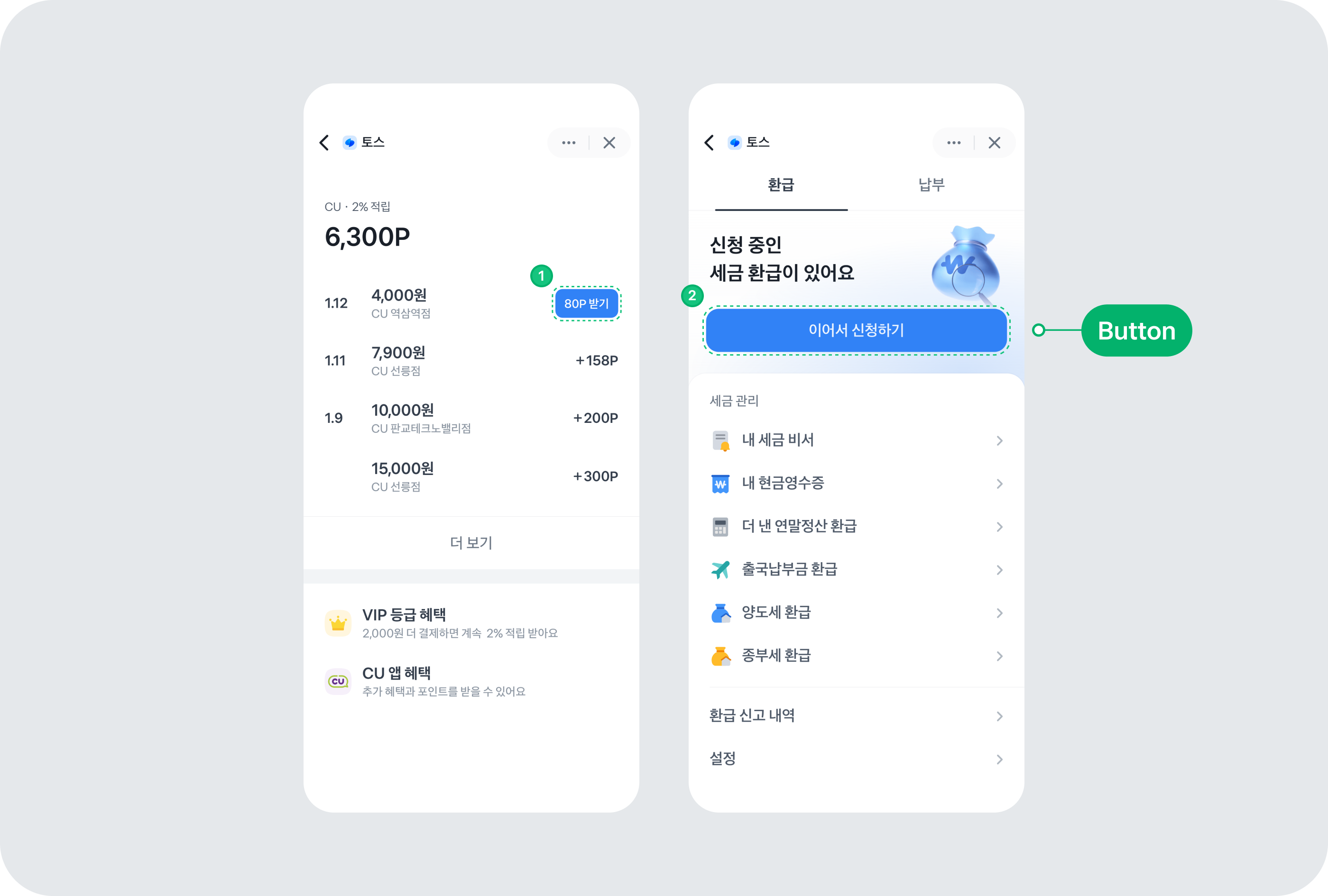
Button 컴포넌트는 사용자가 어떤 액션을 트리거하거나 이벤트를 실행할 때 사용해요. 버튼은 기본적인 UI 요소로, 폼 제출, 다이얼로그 열기, 작업 취소, 삭제와 같은 다양한 액션을 처리하는 데 사용해요.
사용 예제
크기 조정하기
Button 컴포넌트의 크기를 변경하려면 size 속성을 사용하세요. small, medium, large, xlarge 중 하나를 선택할 수 있어요.
스타일
버튼의 스타일을 설정하려면 variant 속성을 사용하세요. 선택 할 수 있는 값에는 fill과 weak이 있어요.
fill
fill variant는 채도가 높아 시각적으로 강렬하고 눈에 띄는 디자인이라 주요 액션을 강조하는 데 적합해요. 사용자가 버튼을 즉시 인지하고 상호작용할 수 있도록 도와줘요.
weak
weak variant는 채도가 낮아 시각적으로 덜 강렬하며 부드럽고 조용한 느낌을 줘요. 그래서 덜 중요한 액션이나 보조적인 버튼에 적합해요. 이 variant를 사용하면 주요 액션과 보조 액션을 명확히 구분할 수 있죠. weak variant의 버튼은 반투명하게 디자인되어 배경색이 살짝 드러나는 모습이에요.
형태
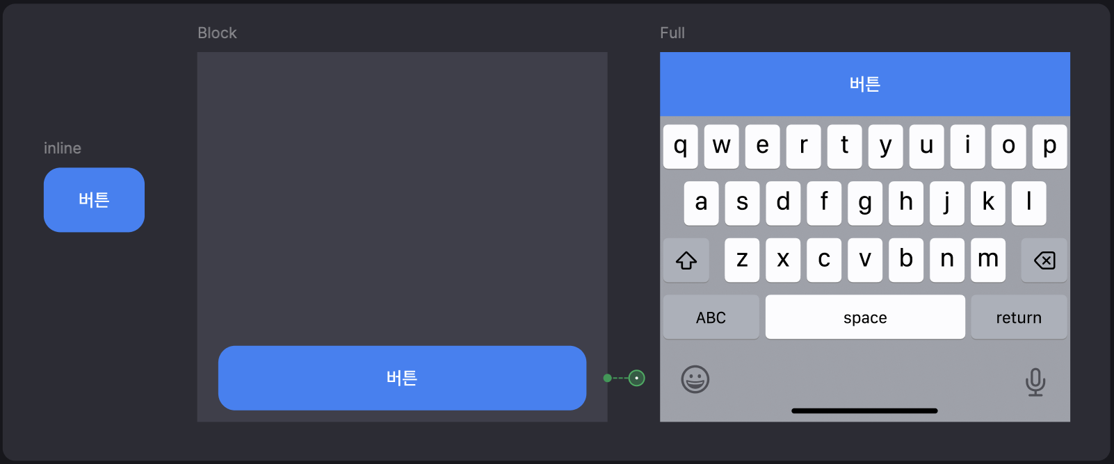
버튼의 형태를 변경하려면 display 속성을 사용하세요. 선택할 수 있는 값에는 inline, block, full이 있어요.
inline: 다른 요소와 나란히 배치돼요.block: 버튼이 줄바꿈되어 화면 너비에 맞게 확장돼요.full: 버튼이 부모 요소의 전체 너비를 차지해요.
<Button display="inline">Inline</Button>
<Button display="block">Block</Button>
<Button display="full">Full</Button>
로딩
loading 속성을 사용해 버튼의 로딩 상태를 나타낼 수 있어요. 로딩 중에는 3개의 인디케이터가 순차적으로 움직이며, 버튼의 너비는 변하지 않아요.
비활성화
버튼을 비활성화하려면 disabled 속성을 사용하세요. 비활성화된 버튼은 사용자가 클릭할 수 없고, 시각적으로도 비활성화된 상태임을 나타내요.
로딩과 비활성화
loading과 disabled 속성을 동시에 사용할 수 있어요. 두 가지 속성을 모두 사용하면 버튼은 로딩 중이면서 비활성화된 상태로 표시돼요.
색상 업데이트
Button 컴포넌트의 색상을 업데이트하기 위해 CSS 변수를 활용할 수 있어요.
--button-color: 버튼 텍스트의 색상을 지정해요.--button-background-color: 버튼의 배경색을 지정해요.--button-disabled-opacity-color: 비활성화 상태일 때 배경색의 투명도를 조절해요.--button-disabled-text-opacity: 비활성화 상태일 때 텍스트의 투명도를 조절해요.--button-gradient-color: 로딩 상태일 때 표시되는 그라데이션 효과의 색상을 지정해요.--button-loader-color: 로딩 상태일 때 표시되는 로더의 색상을 지정해요.--button-loading-background-color: 로딩 상태일 때 버튼 위에 표시되는 딤(dim) 레이어의 색상을 지정해요.--button-loading-opacity: 로딩 상태일 때 딤(dim) 레이어의 투명도를 조절해요.--button-pressed-background-color: 버튼이 눌렸을 때 표시되는 딤(dim) 레이어의 색상을 지정해요.--button-pressed-opacity: 버튼이 눌렸을 때 딤(dim) 레이어의 투명도를 조절해요.
접근성
Button 컴포넌트는 다음과 같이 기본적인 접근성을 제공해요. 덕분에 별도의 설정 없이도 기본적으로 사용자의 접근성을 고려한 형태의 Button 컴포넌트를 제공할 수 있어요.
| 속성 | 접근성 효과 | 설명 |
|---|---|---|
button | 스크린 리더에서 "버튼"으로 인식해요. | 버튼 역할을 명확히 전달해서 사용자가 상호작용 가능하다는 것을 알 수 있어요. |
disabled | 비활성화된 상태를 스크린 리더에서 읽어줘요. | 버튼이 비활성화되어 상호작용할 수 없다는 정보를 스크린 리더로 알려줘요. |
loading | aria-busy 속성을 사용해 로딩 중임을 알려줘요. | 로딩 상태일 때, 스크린 리더가 "작업 중" 상태를 전달해 줘요. |
<Button as="button" htmlType="submit">Submit</Button>
<Button as="a" href="https://example.com">Link</Button>
추가로 지원해야 하는 접근성
개발자가 접근성을 고려해서 다음 내용을 추가로 작업해야 할 때도 있어요. 예를 들어 아이콘 버튼을 사용하거나, 특정 의미를 명확히 전달하기 어려울 때는 컴포넌트에서 제공하는 기본적인 접근성으로는 충분하지 않아요.
적절한 태그 추가하기
as (opens in a new tab) 속성으로 button이나 a 태그를 선택할 수 있어요.
button태그: 버튼으로 작동하고 상호작용할 수 있게 해요.a태그:Button컴포넌트를 링크로 사용할 때는 꼭href속성을 포함해서 목적을 명확히 해주세요.
<Button as="button" htmlType="submit">Submit</Button>
<Button as="a" href="https://example.com">Link</Button>
아이콘만 있거나 설명이 부족할 때
- 버튼에 아이콘만 있거나 텍스트로 목적을 충분히 설명하지 못할 때:
aria-label속성을 사용해 추가 정보를 제공하세요. - 아이콘만 있을 때: 스크린 리더가 버튼의 기능을 알 수 없기 때문에
aria-label을 추가해 주세요. - 설명이 부족할 때: 버튼의 목적이 명확하지 않을 때는 추가 설명을 넣어주세요.
<Button aria-label="좋아요 표시"><HeartIcon /></Button>
<Button aria-label="계정 삭제 - 주의 필요" type="danger">삭제</Button>
로딩 상태에서 추가 정보가 필요할 때
로딩 중일 때 텍스트가 없다면 aria-label을 사용해 어떤 작업을 처리 중인지 알려주세요.
<Button loading aria-label="데이터 로딩 중">
  <LoadingIcon />
</Button>
인터페이스
ButtonProps
| 속성 | 기본값 | 타입 |
|---|---|---|
| as | 'button' | "button"|"a"`as prop`을 통해 버튼의 태그를 변경할 수 있어요. 버튼의 태그를 변경하면 버튼의 기본 속성이 변경돼요. |
| color | 'primary' | "primary"|"danger"|"light"|"dark"버튼의 컬러에 따라 버튼의 색상이 변경돼요. |
| variant | 'fill' | "fill"|"weak"버튼의 형태에 따라 버튼의 색상과 투명도가 변경돼요. |
| display | 'inline' | "inline"|"block"|"full"버튼의 표시 방식에 따라 버튼의 너비와 형태가 변경돼요. |
| size | 'xlarge' | "small"|"medium"|"large"|"xlarge"버튼의 크기에 따라 버튼의 너비와 높이가 변경돼요. |
| loading | - | false|truetrue일 경우 버튼에 로딩 스피너가 표시돼요. |
| disabled | - | false|truetrue일 경우 버튼이 비활성화돼요. |
| type | - | "button"|"submit"|"reset"`type` prop이 사용되어 기존 HTML 버튼 태그의 type 속성을 변경할 때 사용해요. |
| htmlStyle | - | React.CSSProperties`style` prop이 사용되어 기존 HTML 버튼 태그의 style 속성을 변경할 때 사용해요. |