ListRow
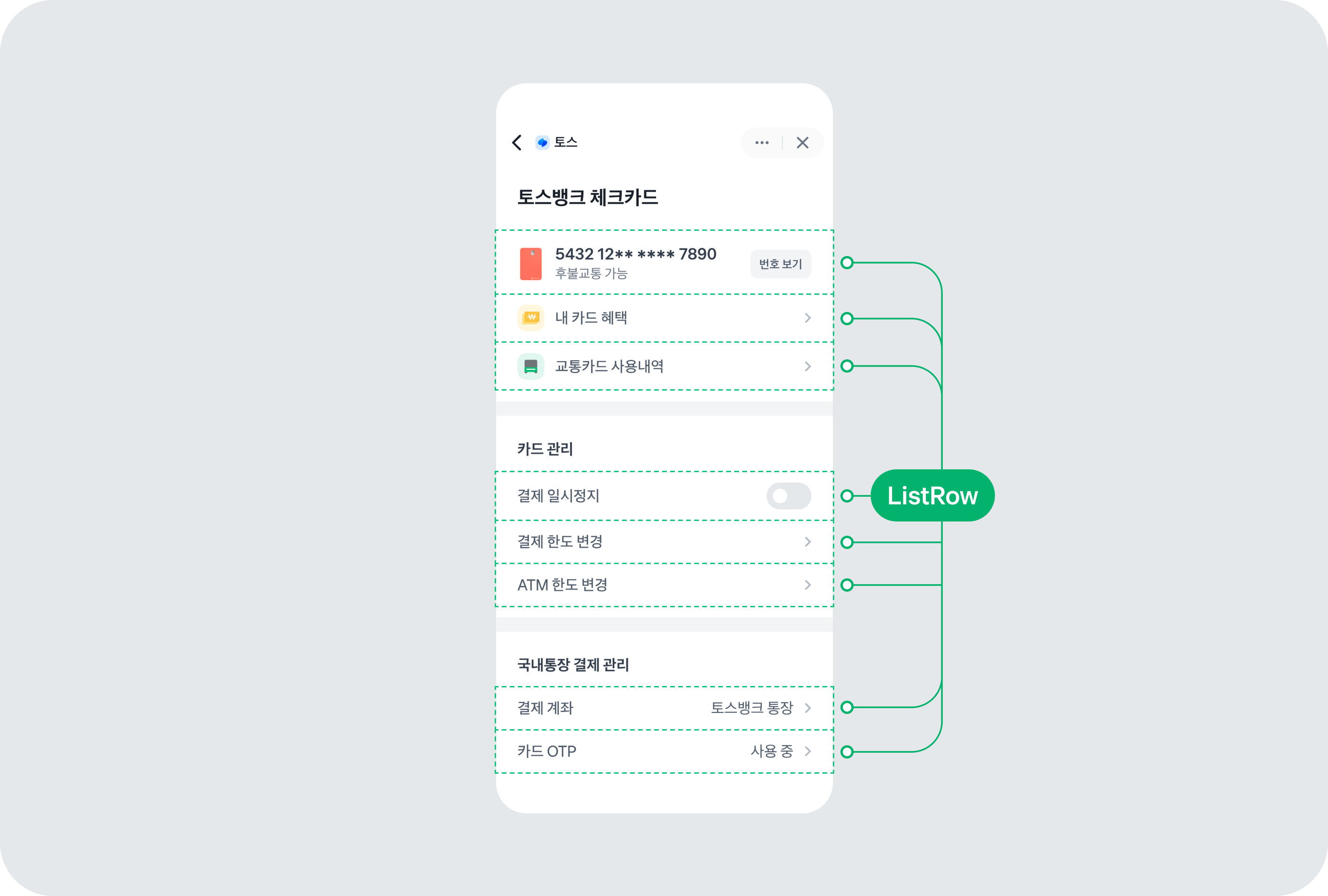
ListRow 컴포넌트는 리스트의 각 행을 나타내는 컴포넌트예요. 왼쪽, 중앙, 오른쪽 영역으로 구성되어 있으며, 다양한 레이아웃과 스타일을 지원해요.
사용 예제
기본 사용
ListRow를 사용하려면 contents를 지정하세요.
<ListRow contents={<ListRow.Texts texts={[{ text: '메뉴 아이템' }]} />} onPress={() => console.log('클릭')} />화살표 추가
withArrow 속성을 사용하면 오른쪽에 화살표가 표시돼요.
<ListRow
  contents={<ListRow.Texts texts={[{ text: '설정' }]} />}
  withArrow
  onPress={() => navigation.navigate('Settings')}
/>
아이콘과 함께 사용
left 속성을 사용해 왼쪽에 아이콘을 추가할 수 있어요.
<ListRow
  left={<ListRow.Icon name="icon-notification" />}
  contents={<ListRow.Texts texts={[{ text: '알림' }]} />}
  withArrow
  onPress={() => {}}
/>
이미지와 함께 사용
<ListRow
  left={<ListRow.Image source={{ uri: 'https://example.com/image.jpg' }} />}
  contents={
    <ListRow.Texts texts={[{ text: '김토스' }, { text: '토스뱅크', typography: 't7', color: colors.grey600 }]} />
  }
  onPress={() => {}}
/>
오른쪽 콘텐츠
right 속성을 사용해 오른쪽에 추가 콘텐츠를 표시할 수 있어요.
<ListRow
  contents={<ListRow.Texts texts={[{ text: '푸시 알림' }]} />}
  right={<Switch value={true} onValueChange={() => {}} />}
/>

<ListRow
  contents={<ListRow.Texts texts={[{ text: '잔액' }]} />}
  right={
    <ListRow.RightTexts
      texts={[{ text: '1,000,000원', fontWeight: 'semiBold' }]}
    />
  }
/>
여러 줄 텍스트
<ListRow
  contents={
    <ListRow.Texts
      texts={[
        { text: '계좌이체' },
        { text: '토스뱅크 · 1234-5678-9012', typography: 't7', color: colors.grey600 },
        { text: '김토스', typography: 't7', color: colors.grey600 },
      ]}
    />
  }
  right={
    <ListRow.RightTexts
      texts={[
        { text: '-50,000원', fontWeight: 'semiBold' },
        { text: '12.31 14:30', typography: 't7', color: colors.grey600 },
      ]}
    />
  }
/>
패딩 조정
// 작은 패딩
<ListRow
  verticalPadding="small"
  contents={<ListRow.Texts texts={[{ text: '작은 패딩' }]} />}
/>

// 큰 패딩
<ListRow
  verticalPadding="large"
  contents={<ListRow.Texts texts={[{ text: '큰 패딩' }]} />}
/>

// 좌우 패딩 제거
<ListRow
  horizontalPadding={0}
  contents={<ListRow.Texts texts={[{ text: '패딩 없음' }]} />}
/>
정렬
// 왼쪽 콘텐츠를 상단에 정렬
<ListRow
  left={<ListRow.Icon name="icon-info" />}
  leftAlignment="top"
  contents={
    <ListRow.Texts
      texts={[
        { text: '제목' },
        { text: '긴 설명 텍스트가 여러 줄로 표시될 수 있어요' },
      ]}
    />
  }
/>

// 오른쪽 콘텐츠를 상단에 정렬
<ListRow
  contents={<ListRow.Texts texts={[{ text: '긴 텍스트' }]} />}
  right={<Txt>오른쪽</Txt>}
  rightAlignment="top"
/>
비활성화
<ListRow
  contents={<ListRow.Texts texts={[{ text: '비활성화된 아이템' }]} />}
  disabled={true}
/>

<ListRow
  contents={<ListRow.Texts texts={[{ text: '비활성화 타입 2' }]} />}
  disabled={true}
  disabledStyle="type2"
/>
애니메이션 효과
ref를 사용해 깜빡임이나 빛나는 효과를 실행할 수 있어요.
const listRowRef = useRef < ListRowRef > null;

const handleBlink = () => {
  listRowRef.current?.blink(1.5);
};

const handleShine = () => {
  listRowRef.current?.shine(2);
};

<ListRow ref={listRowRef} contents={<ListRow.Texts texts={[{ text: '애니메이션 효과' }]} />} onPress={handleBlink} />;
인터페이스
ListRowRef
| 속성 | 기본값 | 타입 |
|---|---|---|
| blink* | - | (duration?: number) => void깜빡임 효과를 실행해요. |
| shine* | - | (playCount?: number) => void빛나는 효과를 실행해요. |
ListRowProps
| 속성 | 기본값 | 타입 |
|---|---|---|
| left | - | React.ReactNode왼쪽에 표시될 내용을 지정해요. |
| contents | - | React.ReactNode중앙에 표시될 메인 콘텐츠를 지정해요. |
| right | - | React.ReactNode오른쪽에 표시될 내용을 지정해요. |
| withArrow | false | false|true오른쪽 화살표를 표시할지 여부를 지정해요. |
| leftAlignment | 'center' | "top"|"center"왼쪽 영역의 수직 정렬을 지정해요. |
| rightAlignment | 'center' | "top"|"center"오른쪽 영역의 수직 정렬을 지정해요. |
| horizontalPadding | - | 0좌우 패딩을 제거하고 싶은 경우 0을 지정해요. |
| verticalPadding | 24 | "extraSmall"|8|"small"|16|"medium"|24|"large"|32상하 패딩을 지정해요. |
| containerStyle | - | StyleProp<ViewStyle>컨테이너의 스타일을 지정해요. |
| style | - | StyleProp<ViewStyle>ListRow의 스타일을 지정해요. |
| onPress | - | () => voidListRow를 클릭했을 때 호출되는 함수예요. |
| preferReducedMotion | false | false|true모션 감소 모드를 사용할지 여부를 지정해요. |
| disabledStyle | 'type1' | "type1"|"type2"비활성화 스타일 타입을 지정해요. |
| disabled | false | false|trueListRow의 비활성화 여부를 지정해요. |
| accessibilityState | - | AccessibilityState접근성 상태를 지정해요. |