ListHeader
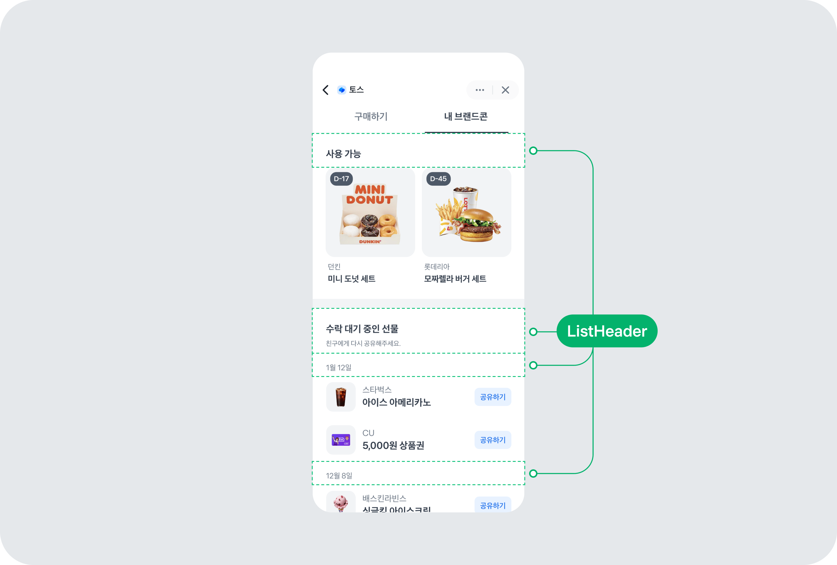
ListHeader 컴포넌트는 사용자가 특정 동작을 실행하거나 추가 정보로 안내될 수 있는 헤더 UI 요소예요. 페이지나 섹션의 상단에 배치되어 사용자에게 제목, 설명, 그리고 상호작용 가능한 요소를 제공할 수 있어요. 주로 제목, 오른쪽의 부가 콘텐츠, 보조 설명을 포함해요.
사용 예제
위치
ListHeader 컴포넌트의 보조 설명은 title 속성을 기준으로 위 또는 아래에 배치될 수 있어요.
upper 속성에 넣으면 상단에, lower 속성에 넣으면 하단에 배치돼요.
주로 ListHeader.DescriptionParagraph 컴포넌트가 사용돼요.
<ListHeader
  upper={<ListHeader.DescriptionParagraph>보조설명 내용</ListHeader.DescriptionParagraph>}
  title={
    <ListHeader.TitleParagraph typography="t5" fontWeight="bold">
      타이틀 내용
    </ListHeader.TitleParagraph>
  }
  right={
    <ListHeader.RightText typography="t7">
      악세사리
    </ListHeader.RightText>
  }
/>

<ListHeader
  title={
    <ListHeader.TitleParagraph typography="t5" fontWeight="bold">
      타이틀 내용
    </ListHeader.TitleParagraph>
  }
  right={
    <ListHeader.RightText typography="t7">
      악세사리
    </ListHeader.RightText>
  }
  lower={<ListHeader.DescriptionParagraph>보조설명 내용</ListHeader.DescriptionParagraph>}
/>
제목
ListHeader에서 제목을 사용하는 방법으로 ListHeader.TitleParagraph,
ListHeader.TitleTextButton, 그리고 ListHeader.TitleSelector 세 가지 방법을 제공하고 있어요.
제목으로 텍스트(문단) 사용하기
ListHeader 컴포넌트에서 제목을 텍스트(문단)로 설정할 때,
title 속성에 ListHeader.TitleParagraph을 사용해요.
ListHeader.TitleParagraph은 typography와 fontWeight를 지정해 스타일을 변경할 수 있어요.
<ListHeader
  upper={<ListHeader.DescriptionParagraph>보조설명 내용</ListHeader.DescriptionParagraph>}
  title={
    <ListHeader.TitleParagraph typography="t5" fontWeight="bold">
      타이틀 내용
    </ListHeader.TitleParagraph>
  }
  right={<ListHeader.RightText typography="t7">악세사리</ListHeader.RightText>}
/>
제목으로 텍스트 버튼 사용하기
ListHeader 컴포넌트에서 제목을 클릭할 수 있는 텍스트 버튼으로 설정할 때,
title 속성에 ListHeader.TitleTextButton을 사용해요.
ListHeader.TitleTextButton은 typography와 fontWeight를 지정해 스타일을 변경할 수 있어요.
형태는 variant 속성으로 TextButton 컴포넌트의 타입으로 정의된 clear, arrow, underline 세 가지를 제공해요.
<ListHeader
  upper={<ListHeader.DescriptionParagraph>보조설명 내용</ListHeader.DescriptionParagraph>}
  title={
    <ListHeader.TitleTextButton typography="t4" color={adaptive.grey600} fontWeight="bold" variant="clear">
      타이틀 내용
    </ListHeader.TitleTextButton>
  }
  right={
    <ListHeader.RightText typography="t6">
      악세사리
    </ListHeader.RightText>
  }
/>
<ListHeader
  upper={<ListHeader.DescriptionParagraph>보조설명 내용</ListHeader.DescriptionParagraph>}
  title={
    <ListHeader.TitleTextButton typography="t4" color={adaptive.grey600} fontWeight="bold" variant="arrow">
      타이틀 내용
    </ListHeader.TitleTextButton>
  }
  right={
    <ListHeader.RightText typography="t6">
      악세사리
    </ListHeader.RightText>
  }
/>
<ListHeader
  upper={<ListHeader.DescriptionParagraph>보조설명 내용</ListHeader.DescriptionParagraph>}
  title={
    <ListHeader.TitleTextButton typography="t4" color={adaptive.grey600} fontWeight="bold" variant="underline">
      타이틀 내용
    </ListHeader.TitleTextButton>
  }
  right={
    <ListHeader.RightText typography="t6">
      악세사리
    </ListHeader.RightText>
  }
/>
제목으로 셀렉터 사용하기
제목에 선택 가능한 드롭다운 스타일의 셀렉터를 사용하고 싶을 때, title 속성에
ListHeader.TitleSelector를 사용해요. ListHeader.TitleSelector은
typography를 지정해 스타일을 변경할 수 있어요.
<ListHeader
  upper={<ListHeader.DescriptionParagraph>보조설명 내용</ListHeader.DescriptionParagraph>}
  title={
    <ListHeader.TitleSelector typography="t4" fontWeight="bold">
      타이틀 내용
    </ListHeader.TitleSelector>
  }
  right={<ListHeader.RightText typography="t6">악세사리</ListHeader.RightText>}
/>
화살표
오른쪽에 화살표 아이콘과 텍스트를 배치하려면 ListHeader.RightArrow를 사용해요.
ListHeader.RightArrow는 클릭 가능한 요소로 사용할 수 있고,
onClick을 추가해 클릭 시 발생하는 동작을 정의할 수 있어요.
<ListHeader
  upper={<ListHeader.DescriptionParagraph>보조설명 내용</ListHeader.DescriptionParagraph>}
  title={
    <ListHeader.TitleParagraph typography="t7" fontWeight="bold">
      타이틀 내용
    </ListHeader.TitleParagraph>
  }
  right={<ListHeader.RightArrow typography="t6">악세사리</ListHeader.RightArrow>}
/>

<ListHeader
  title={
    <ListHeader.TitleParagraph typography="t7" fontWeight="bold">
      타이틀 내용
    </ListHeader.TitleParagraph>
  }
  right={<ListHeader.RightArrow typography="t6">악세사리</ListHeader.RightArrow>}
  lower={<ListHeader.DescriptionParagraph>보조설명 내용</ListHeader.DescriptionParagraph>}
/>
인터페이스
ListHeaderProps
| 속성 | 기본값 | 타입 |
|---|---|---|
| title* | - | React.ReactNode`ListHeader`의 제목을 설정해요. 제목 영역에는 주로 `ListHeader.TitleParagraph`, `ListHeader.TitleSelector`, `ListHeader.TitleTextButton` 컴포넌트가 사용돼요. |
| upper | - | React.ReactNode`ListHeader`의 상단에 표시될 보조 설명 영역이에요. `ListHeader.Description` 컴포넌트를 사용해서 보조 설명을 추가할 수 있어요. |
| titleViewStyle | - | StyleProp<ViewStyle>제목 영역의 스타일을 설정해요. |
| right | - | React.ReactNode`ListHeader`의 오른쪽에 표시될 요소를 설정해요. 오른쪽 영역에는 주로 `ListHeader.RightArrow` 또는 `ListHeader.RightText` 컴포넌트가 사용돼요. |
| rightViewStyle | - | StyleProp<ViewStyle>오른쪽 영역의 스타일을 설정해요. |
| lower | - | React.ReactNode`ListHeader`의 하단에 표시될 보조 설명 영역이에요. `ListHeader.Description` 컴포넌트를 사용해서 보조 설명을 추가할 수 있어요. |
| onPress | - | (event: GestureResponderEvent) => void`ListHeader` 컴포넌트를 눌렀을 때 실행되는 함수예요. |
ListHeaderDescriptionParagraphProps
| 속성 | 기본값 | 타입 |
|---|---|---|
| children* | - | React.ReactNode`ListHeader.Description` 컴포넌트 내부에 표시될 내용을 설정해요. |
ListHeaderRightArrowProps
| 속성 | 기본값 | 타입 |
|---|---|---|
| typography* | - | "t6"|"t7"`ListHeader.RightArrow` 컴포넌트의 텍스트 스타일을 설정해요. |
| children* | - | React.ReactNode`ListHeader.RightArrow` 컴포넌트 내부에 표시될 내용을 설정해요. |
| color | adaptive.grey700 | string`ListHeader.RightArrow` 컴포넌트의 텍스트 색상을 설정해요. |
| style | - | StyleProp<ViewStyle>`ListHeader.RightArrow` 컴포넌트의 스타일을 변경할 때 사용해요. |
| onPress | - | (event: GestureResponderEvent) => void`ListHeader.RightArrow` 컴포넌트를 눌렀을 때 실행되는 함수예요. |
ListHeaderRightTextProps
| 속성 | 기본값 | 타입 |
|---|---|---|
| typography* | - | "t6"|"t7"`ListHeader.RightText` 컴포넌트의 텍스트 스타일을 설정해요. |
| children* | - | React.ReactNode`ListHeader.RightText` 컴포넌트 내부에 표시될 내용을 설정해요. |
| color | adaptive.grey700 | string`ListHeader.RightText` 컴포넌트의 텍스트 색상을 설정해요. |
| style | - | StyleProp<TextStyle>`ListHeader.RightText` 컴포넌트의 스타일을 변경할 때 사용해요. |
ListHeaderTitleParagraphProps
| 속성 | 기본값 | 타입 |
|---|---|---|
| children* | - | React.ReactNode`ListHeader.TitleParagraph` 컴포넌트 내부에 표시될 내용을 설정해요. |
| size | - | 20|17|13`ListHeader.TitleParagraph` 컴포넌트의 텍스트 크기를 설정해요. |
| typography | 't5' | "t7"|"t4"|"t5"`ListHeader.TitleParagraph` 컴포넌트의 텍스트 스타일을 설정해요. |
| fontWeight | 'regular' | "thin"|"extralight"|"extraLight"|"light"|"normal"|"regular"|"medium"|"semibold"|"semiBold"|"bold"|"extrabold"|"extraBold"|"heavy"|"black"`ListHeader.TitleParagraph` 컴포넌트의 텍스트 굵기를 설정해요. |
| numberOfLines | - | number`ListHeader.TitleParagraph` 컴포넌트의 텍스트 라인 수를 제한할 때 사용해요. |
| color | adaptive.grey800 | string`ListHeader.TitleParagraph` 컴포넌트의 텍스트 색상을 설정해요. |
| style | - | StyleProp<TextStyle>`ListHeader.TitleParagraph` 컴포넌트의 스타일을 변경할 때 사용해요. |
ListHeaderTitleSelectorProps
| 속성 | 기본값 | 타입 |
|---|---|---|
| typography* | - | "t7"|"t4"|"t5"`ListHeader.TitleSelector` 컴포넌트의 텍스트 스타일을 설정해요. |
| fontWeight* | 'regular' | "thin"|"extralight"|"extraLight"|"light"|"normal"|"regular"|"medium"|"semibold"|"semiBold"|"bold"|"extrabold"|"extraBold"|"heavy"|"black"`ListHeader.TitleSelector` 컴포넌트의 텍스트 굵기를 설정해요. |
| children* | - | React.ReactNode`ListHeader.TitleSelector` 컴포넌트 내부에 표시될 내용을 설정해요. |
| numberOfLines | - | number`ListHeader.TitleSelector` 컴포넌트의 텍스트 라인 수를 제한할 때 사용해요. |
| onPress | - | (event: GestureResponderEvent) => void`ListHeader.TitleSelector` 컴포넌트가 눌렸을 때 실행되는 함수예요. |
| color | adaptive.grey900 | string`ListHeader.TitleSelector` 컴포넌트의 텍스트 색상을 설정해요. |
| style | - | StyleProp<TextStyle>`ListHeader.TitleSelector` 컴포넌트의 스타일을 변경할 때 사용해요. |
ListHeaderTitleTextButtonProps
TextButton 컴포넌트를 확장하여 제작했어요. TextButton 컴포넌트의 모든 속성을 사용할 수 있어요.
| 속성 | 기본값 | 타입 |
|---|---|---|
| typography* | - | "t7"|"t4"|"t5"`ListHeader.TitleTextButton` 컴포넌트의 텍스트 스타일을 설정해요. |