Border
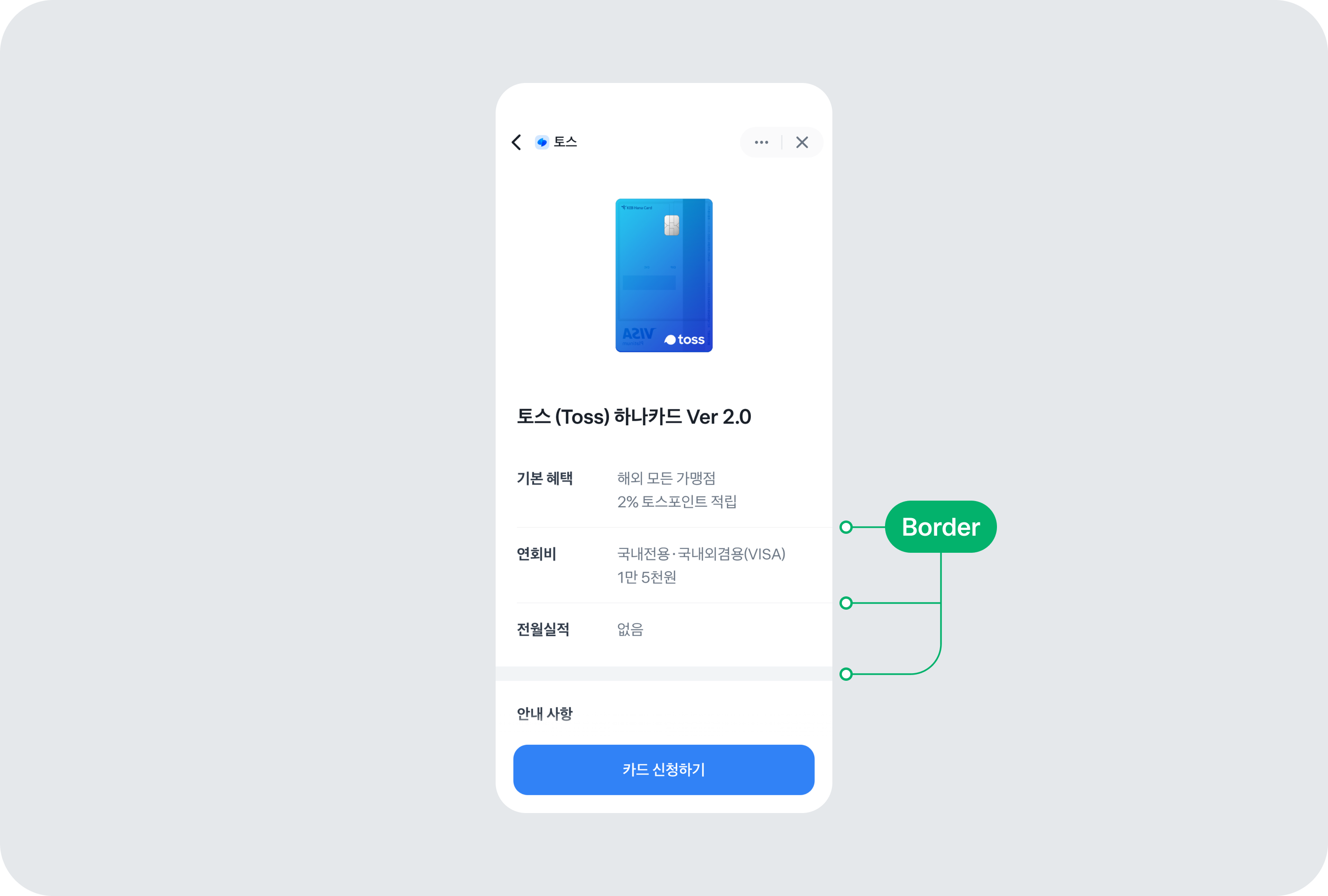
Border 컴포넌트는 요소 주위에 선을 그려서 요소 간의 구분을 명확히 하고 싶을 때 사용해요. UI 요소 간의 명확한 구분과 계층 구조를 표현할 수 있어요.
Border 컴포넌트는 주로 리스트나 섹션을 구분하는 데 사용돼요.
동해물과 백두산이
동해물과 백두산이
사용법
항목 나누기
리스트나 섹션을 나눌 때 Border 컴포넌트를 사용할 수 있어요. type 속성에 따라 적용되는 스타일이 다르니, 필요에 따라 적절한 값을 선택하세요.
full: 전체 너비에 맞춰서 선이 그려져요.padding24: 양쪽에24px의 여백을 두고 선이 그려져요.
동해물과 백두산이
동해물과 백두산이
<View
  style={{
    display: 'flex',
    flexDirection: 'column',
    width: 350,
    borderRadius: 20,
    backgroundColor: colors.grey100,
  }}
>
  <ListRow contents={<ListRow.Texts type="1RowTypeA" top="동해물과 백두산이" />} />
  <Border type="full" />
  <ListRow contents={<ListRow.Texts type="1RowTypeA" top="동해물과 백두산이" />} />
</View>
왼쪽에 여백주기
왼쪽 여백이 필요한 경우에는 type 값을 padding24로 사용하세요.
동해물과 백두산이
동해물과 백두산이
<View
  style={{
    display: 'flex',
    flexDirection: 'column',
    width: 350,
    borderRadius: 20,
    backgroundColor: colors.grey100,
  }}
>
  <ListRow contents={<ListRow.Texts type="1RowTypeA" top="동해물과 백두산이" />} />
  <Border type="full" />
  <ListRow contents={<ListRow.Texts type="1RowTypeA" top="동해물과 백두산이" />} />
</View>
구간 나누기
Border 컴포넌트로 구간을 나눈다면, type의 값으로 height16을 사용하세요.
동해물과 백두산이
동해물과 백두산이
<View
  style={{
    display: 'flex',
    flexDirection: 'column',
  }}
>
  <ListRow contents={<ListRow.Texts type="1RowTypeA" top="동해물과 백두산이" />} />
  <Border type="padding24" />
  <ListRow contents={<ListRow.Texts type="1RowTypeA" top="동해물과 백두산이" />} />
</View>
<View
  style={{
    display: 'flex',
    flexDirection: 'column',
  }}
>
  <ListRow contents={<ListRow.Texts type="1RowTypeA" top="동해물과 백두산이" />} />
  <Border type="height16" />
  <ListRow contents={<ListRow.Texts type="1RowTypeA" top="동해물과 백두산이" />} />
</View>
인터페이스
BorderProps
| 속성 | 기본값 | 타입 |
|---|---|---|
| style | "full" | "full"|"padding24"|"height16"`Border` 컴포넌트의 형태를 결정해요. `Border` 컴포넌트로 항목을 나눈다면 `full` 또는 `padding24`를 사용하세요. 구간을 나눈다면 `height16`을 사용하세요. |